Does your website “work” on mobile?
Thu, Oct 6 2016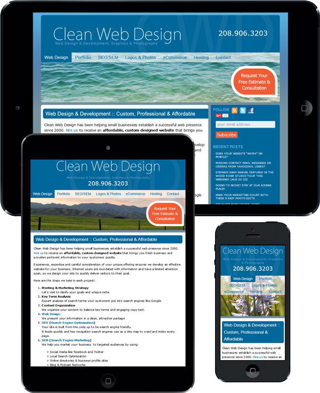
Our homepage displayed on iPad, iPad mini and iPhone 5.
Did you know that 65% of all digital media time is now spent on mobile devices/smart phones?
That means that your website better be mobile friendly or you will certainly lose visitors. You don’t want to turn away potential traffic or sales, just because your website hasn’t been updated yet, do you?
Clean Web Design can modify your website style code so its display is optimized for mobile devices (tablets like iPad and smart phones including iPhones and Androids).

We add media queries to your existing CSS to transform your current static website into a dynamic, flowing design that will look great at any size.
Contact us today to find out more, and to get a custom estimate!
Call Cory (720) 588-0760 or Lisa (208) 906-3203
or email us info@cleanwebdesign.com
*65% of all media time is now spent on mobile devices according to marketingland.com
I am confused, I guess, and with all due respect… From a programmer’s perspective, why would an expert choose to limit ANY potential business, when the understood goal was to generate ALL potential business in the first place? Why was the code entered to our still inactive website not optimized already, or as your ad says, updated to begin with? What are your thoughts about this?
Thanks,
Steve
Hi Steve, we make all new sites under development mobile friendly by default, but many of our clients this email went to have much older sites that were designed before media queries were available and smart phones were just getting a foothold. For many years all of sites have been viewable and usable in small screens, but that isn’t the same as responsive.
Responsive means the layout changes depending on screensize – for instance, the desktop will show menu content in a sidebar that is 25% wide while the main content is 75% wide, but in portrait view on an iPhone, the sidebar wraps below content and both become 100% wide.
Your graphic keeps moving from right to left. Cant read a moving target.
Hi Tina, thanks for that feedback. It was just intended to show how the content adjusts to different sizes, but if you’re trying to read the actual content, it is super annoying. Sorry about that!
Despite the graphic confusion, do you want Cory to check your site for mobile readiness? He can send you still screen shots of how it’s behaving. You can also take a look at it in your phone.